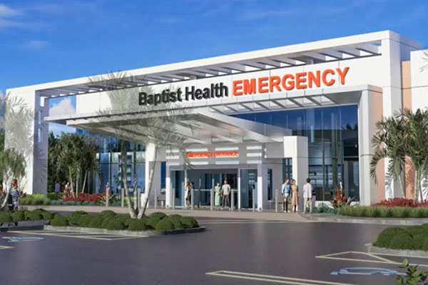
Meeting Thursday, Oct. 17, the Royal Palm Beach Village Council gave Baptist Health the go-ahead for a planned “integrated care center” on State Road 7, but not before scaling back several of the many sign variances requested for the facility.
At issue were a series of variances, a special exception use, site plan modification and architectural approval that would allow the new healthcare facility.
Slated for 450 S. State Road 7, just north of Royal Palm Beach’s border with Wellington, Baptist Health will be retrofitting a 58,341-square-foot building that once housed a Toys ‘R’ Us store. It will include both a medical office component and a stand-alone emergency room.
First, the council took up allowing the special exception use for the “integrated care center.” At the request of Baptist Health, the council added the use to the village code earlier this year.
Planning & Zoning Director Bradford O’Brien made presentations on behalf of the village, while Lentzy Jean-Louis of Urban Design Studios represented Baptist Health.
Jean-Louis gave an overview of the entire project.
“We are coming before you this evening with an adaptive reuse of the existing Toys ‘R’ Us facility,” Jean-Louis said, noting that the repurposed building will be slightly larger than the existing building due solely to the addition of vestibules near the entrances.
The site is part of a commercial development first approved in 2011. This is the largest of several buildings, which also includes adjacent retail and office buildings. The current applications only change the 4.49-acre southern portion of the overall development. The site’s main access is off SR 7, which will not change.
The plan won traffic approval from the county, since the planned medical use has a lower traffic impact than the previously approved big box retail use.
The emergency room component of the plan will include 18 beds and 27,313 square feet, while 31,418 square feet will be for medical office space.
Vice Mayor Jeff Hmara asked about sirens and noise at the site, and Jean-Louis said there will be strict limitations to the use of sirens, which are not expected to be used more than a few times a day.
After the overview of the project, the council quickly approved the special exception use, as well as code variances for landscape plantings and width of the drive aisles, both required due to circumstances unique to the site.
However, when it came time to discuss the detailed list of 10 sign variances being requested by Baptist Health for the site, several council members expressed significant concerns.
The signs included a larger monument sign, additional wayfinding signs, three wall signs instead of one, as well as other additional signs denoting the different parts of the project. Village staff did not support the sign variances. However, O’Brien noted that the applicant did work with village staff already to reduce the number of wayfinding signs from eight to six, and wall signs from four to three.
Jean-Louis went sign by sign through the requests to explain the need for them. “Each sign does have its specific rationale as to how we want to properly direct patients and visitors on the site,” he said.
Hmara noted that Royal Palm Beach has one of the more permissive sign codes in the area. “We do find our sign code something that we want to adhere to, and only consider a variance if there is a really compelling reason,” he said.
Councilman Richard Valuntas agreed that directional signs are crucial when dealing with an emergency room use. “You need to know where to go,” he said. “It needs to be bold and readily accessible to the public.”
Councilwoman Selena Samios did not want the sign package to be an all-or-nothing decision. “There’s some here that I approve of, and some here that I don’t approve of,” she said.
Village Attorney Mitty Barnard said that the sign variance package is being presented as one item, and unless the applicant is willing to make changes, it would need to be approved or denied as is.
Valuntas was fine with the six wayfinding signs, but Samios thought some were not necessary, particularly when paired with the large building signage. There were no issues with the front wall signs, particularly since one of them is not quite a sign, but rather the Baptist Health “pineapple” logo.
Samios felt that the extra sign on the south side of the building is “overkill,” pointing out that the facility is not that big. Councilwoman Jan Rodusky felt that the second sign denoting “Emergency Entrance” over the doors, under the large “Baptist Health Emergency” wall sign is not necessary and reminded her of a car dealership.
After the discussion, the council took a brief recess so that the specific sign changes agreed to could be specified.
“We appreciate everyone’s input. We look at things one way, and you look at things another way,” said Ken Tuma with Urban Design Studios, who took the lead in the sign negotiations. “This has been a good learning experience for us also.”
The council and the applicant agreed to the following changes: changing the monument sign, adding the address on the side; removing one of the wayfinding directional signs as being repetitive; removing the word “Entrance” from the signs over the doors, leaving just “Emergency” and “Medical Office;” an additional “Baptist Health” sign on the south side of the building was removed; and a vertical “Emergency” sign was removed.
Once the changes were agreed to, the remaining sign variances were approved unanimously.
Finally, the council approved a site plan modification for the overall parcel, which was approved unanimously with the sign changes. Conditions attached to the approval include a contribution to the village’s tree bank due to trees removed as part of the relocation of the driveway, as well as participation in the Art in Public Places program.


